Use a tooltip component to add context to elements on the page. Tooltips are popups that display information related to an element when the element receives keyboard focus, or when somone mouse hovers over the element.
Tooltips should be our last resort for conveying information, because they are hidden by default and usually provide zero or very little visual indicator of its existence. If you are unsure which alternative to use, consult a designer or the Design Systems team at Appfire for advice.
Import
import { Tooltip } from "@fuegokit/react";
Additional styling guides and examples are coming soon. For now, explore the examples at Storybook.
Usage
<Tooltip.Provider><Tooltip><Tooltip.Trigger asChild><AtlasButton>Hover or Focus me</AtlasButton></Tooltip.Trigger><Tooltip.Portal><StyledRadixTooltipContent sideOffset={5}>Nicely done!<StyledRadixTooltipArrow offset={10} />
Applying CSS
You can style the Tooltip component using Fuegokit's design tokens with your CSS styling solution of choice.
CSS-in-JS
To achieve the example above using CSS-in-JS, use the themeGet function with @fuegokit/tokens:
//see https://fuegokit.design/tokens for token themesconst StyledRadixTooltipContent = styled(Tooltip.Content)`transform-origin: "var(--radix-tooltip-content-transform-origin)";// ensures content isn't selectable// do NOT put interactive content inside a Tooltipuser-select: none;background-color: ${themeGet("colors.background.neutral.bold.default")};color: ${themeGet("colors.elevation.surface.default.[default]")};font-size: ${themeGet("fontSizes.3")};
To achieve the example above using CSS modules, use CSS variables that ship with @fuegokit/tokens.
/* YourComponent/YourComponent.module.css; see https://fuegokit.design/tokens for token themes */.TooltipContent {transform-origin: var("--radix-tooltip-content-transform-origin");/* ensures content isn't selectabledo NOT put interactive content inside a Tooltip */user-select: none;background-color: var("--background-neutral-bold");color: var("--surface");font-size: var("--fontSize-3");
Apply the CSS module styles using the className prop in React.
import classNames from "./MyComponent.module.css";const MyTooltipComponent = () => {return (<Tooltip.Provider><Tooltip><Tooltip.Trigger asChild><AtlasButton>Hover or Focus me</AtlasButton></Tooltip.Trigger>
Accessibility
Tooltips are rarely the appropriate choice.
Misusing a tooltip can result in many accessibility issues.
Always consider not using a tooltip for an improved user experience.
Here are a few quick alternatives to tooltips to consider:
- Persist the content in a way that it's always available on the page or in the interface.
- Avoid duplicating content. If the tooltip duplicates content that is already available, remove it.
- Use a modal instead. Modals are accessible for mobile users, and they allow structured content to be presented accessibly that might otherwise be crammed into a tooltip.
- Use a disclosure that allows both mobile and desktop device users the ability to show or hide content.
If you must use a tooltip, ensure that:
- The tooltip is discoverable and readable with a mouse, touchscreens, eye-tracking devices, and other pointer devices, keyboard, screen readers, zoom software, and any other assistive technology.
- The tooltip provides relevant information that may be helpful to learn the UI, but is not required to operate it.
- The tooltip doesn't block a user from performing any other task on the screen.
- The tooltip is not accidentally dismissed by magnification software.
Anatomy
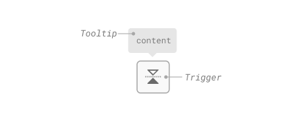
Tooltip
Keyboard accessibility
| Key | Description |
|---|---|
| Tab | Opens/closes the tooltip without delay. |
| Space | If open, closes the tooltip without delay. |
| Enter | If open, closes the tooltip without delay. |
| Escape | If open, closes the tooltip without delay. |
Features
- Ecosystem-agnostic, accessible tooltip that can be styled as needed.
- Labeling support for screen readers and exposed as a tooltip to assistive technology via ARIA
- Native tooltip focus behavior
- Closes when the trigger is activated or when pressing escape
- Supports custom timings
- Handles collisions
- Matches native tooltip behavior with delay on hover of first tooltip and no delay on subsequent tooltips